The PlanMinder Manual - 06 Chronos
This is one chapter from the manual. Access the full manual here.
Chronos
▶ Video reference Manager @ 2:16Chronos is the ancient Greek word for time as on a timeline. This view shows the schedule on a timeline as a Gantt chart, but with more information than you normally find in a Gantt chart.
You can interact with the chart and change things to optimize the schedule, but you can not manually move activities on the timeline. The timeline is updated when you click the scheduler button, and the automatic scheduler is run.

On the left side is a list of activities, milestones and the other plan elements. The view type decides in what order they are shown. On the right side is the timeline.
Navigation
With the mouse on the time line area you can press and hold the left mouse button to pan the view. Use the scroll wheel to zoom in and out on the timeline. With the mouse over the list area on the left you can use the scroll wheel to scroll up and down the list. You can also use the keyboard to navigate.
Chronos keyboard commands:
- + Zoom in
- - Zoom out
- w Pan up
- a Pan left
- s Pan down
- d Pan right
- Arrow keys to Pan
- h or HOME Reset timeline pan to today
Holding the mouse still in the time line area will display a context sensitive note with information about the date and activity. You can right click to pin the note, and then use left and right arrow keys to move it one day at a time. Right clicking in the list area will open the description overlay.
The list is displayed as a hierarchical tree view. Click on the leftmost symbol to hide its indented children. Items with hidden children has a down arrow indicator. Click on the symbol to expand.
 Above the list is a toolbar with a collapse all button,
 and an expand all button.

To use the search bar, start typing a search term in the text field. Select if you want to match start of names, or anywhere inside a name. Use the up and down buttons to jump between matching names. The text frame becomes red if there are no matches.
Chart symbols
Activities
Activities are displayed as blocks on the timeline, indicating when they are scheduled for work according to the expected outcome schedule. This is based on the expected work needed for each individual activity. The scheduler also run ten thousand additional simulations with the work for each activity randomized according to the entered estimates. There are ways to display statistical information from these runs too. One important thing to remember is that the schedule you see is not an absolute truth. It is just one relatively likely projection of the future. More on that later.

Days where work is scheduled are colored. Days where work could be done, but the assigned person is not available, are framed but not filled. This could be because the person is not working, or is working on something with higher priority.
Completed activities are marked with a green background in the list
Dependencies
Click on a row in the list to highlight it. This will also show dependencies as arrows. Both the items the selected item is dependent on, and the items that are dependent on it are indicated. You can select more than one row at a time by holding shift when you click.
Milestones
The dates when a milestone is expected to be reached is indicated by a box and whiskers plot. An x marks the date it will be reached according to the expected outcome schedule. The long vertical bar indicates the 50 % date, where it is equally likely that it will be reached before as after. There is at least a 50 % probability that the milestone will be reached on one of the dates in the green boxed area. The left whisker indicates the day where it is less than 10 % probability that it will be reached any earlier. The right whisker indicates the day where it is at least 90 % probable that it will have been finished.

If the milestone is a deadline, the deadline date will be indicated by a red milestone symbol in the timeline. The probability of reaching the deadline on time is shown on the list row.
In free tier mode where no Monte Carlo simulation data is available, milestones are only indicated on the expected outcome date.
External activities

External activities are shown as a gray line, with a ring on the expected done date. Completed external activities are marked with green background in the list.
Discrete Risks

For discrete risks, a green circled check mark is displayed on the date it is expected to be resolved to OK. If the probability of failure is greater than 50 %, a circled X is displayed on the date where it is expected to be resolved as a fail, with a line connecting it to the expected resolved date.
Start points

Start points are indicated with the start point symbol on the date for the earliest start. Passed start points are marked with a green background in the list.
Edit and Reassign
You can double click on a line in the list to open its edit dialogue. (Not on any of the symbols.) If you are authorized to you can change things there, save and then press the schedule button to see the effect.
Activities has a person symbol in the personal color of the assigned person, and their initials on the right side of the list row. Click on the person symbol to reassign the activity to someone else. You can hold shift and click to mark multiple activities before opening the dialog, and reassign multiple activities at once.
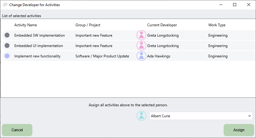
Click on the run scheduler button to update the schedule and see the effect.
View types
There are three view types for the Chronos view.
 Organize by prio points
The Organize by prio points option is the default view. It lists all prio points in priority order, with their dependent activities and other project entries as children. This view tends to show the most immediate activities high up in the list, and is good when looking for ways to optimize the plans.
 Organize by people
The Organize by people option groups activities by assigned person. It is useful when you want to see what each team member is scheduled to do. On a person row, all days with scheduled work are marked with color. You can use the hover pop up to see what is scheduled on each day.
This view can be used to find possible idle time, and to get an overview of your personal schedule.
 Organize by Project
Organize by Project creates a hierarchical view corresponding to the project tree view used on other pages. This way you can get an overview of the schedule for individual projects.
The project row has an indication of how much work is scheduled on each day. The indicator bar grows taller and darker the more work is scheduled on that day.

You can use the hover pop up to see up to three of the scheduled activities for each day. Right click to lock the pop up, and use right and left arrow keys to step it one day at a time.
The total amount of work scheduled is displayed to the right of every project list row.
Color
There are four options to color activities on the timeline
 Color by people:
Activities are colored by the personal color of the assigned person.
 Color by project:
Each project is assigned a color and activities are colored accordingly.
 Color by activity group:
Activities are colored by the group they belong to, if any.
 Use one color:
Everything is blue.
Information
There are four buttons under information to alter what information is displayed. All options are not available for all view types.
 Show uncertainty as box plot
If you enable Show Uncertainty as Box Plot all rows get a box plot indicator for when they are likely to be done.
 Hide completed
The hide completed option removes all completed or reached entries from the list. These are the entries with green background.
 Show availability probability for people
The Show availability probability for people option is only valid for the Organize by People view type. It ads a background gradient indicating how likely each person is to have scheduled work on any given date, according to the Monte Carlo simulation. The background is darker the more likely it is that the person will have scheduled work.

Use the hover pop up to see an actual value for the probability. You can right click to lock the hint and use left and right arrow keys to step one day at a time.
 Show milestone cumulative probability distribution
This options ads a cumulative probability distribution plot to every milestone row. It displays the same kind of information as the box plot, but with more detail and resolution. For every date the plot shows how likely it is that the milestone will be reached on or before this date. This plot thus grows from zero to 100 % over time.
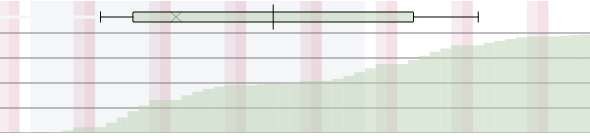
If a project has a discrete risk with a big impact, it may be that the milestone will either finish early or late, but unlikely in-between. This is difficult to read out from a box plot, but becomes more obvious when seeing the cumulative probability distribution. If the probability does not change from one day to another, and the plot is flat, it is unlikely that anything will happen on this day.
Analysis
There are three analysis function buttons. These are the same functions that are available on the Kairos view. Follow the links to the full descriptions.
 Criticality Analysis to find most critical activities for a prio-point milestone in a project.
 Bottleneck Analysis to find bottlenecks for a prio-point milestone.
 Key Person Analysis to find out what persons are most important to reach a prio-point milestone.
If analysis data exists and is displayed the corresponding button is framed. In Chronos view the analysis result is shown by coloring the rightmost part of the corresponding element line. The actual value and what analysis it is from is shown as a on mouse over hint.

As both Criticality and Bottleneck analysis produces values for activities, only the last performed analysis is shown.
Optimizing a plan
A common task for project and department managers is to optimize plans by changing resource allocation and priorities.
You can optimize your plan for time to market, cost, or risk. Probably you need to find a balance between all three.
For short term planning, the “Organize by Prio Points” view type is good for finding optimization possibilities. The highest priority milestones are on top. You can look for an activity with framed days, indicating that it is, or will be, ready to start, but the assigned person is busy. Then scroll down to find a suitable person working on something with lower priority, that can do the higher priority activity instead.
A bit into the future the schedule becomes a bit too blurred for fine tuned optimizations to be meaningful. You can get a feel for this from the size of the box plots, especially if you enable box plots for activities with the “Show uncertainty as Box Plots” option.
For this the “Organize by People” view type combined with “Show Availability Probability for People” option may help. This way you can see who is more likely to be available, and reassign them to activities in other projects.
To avoid sub optimizing one project to the decrement of the overall best, you can switch to the collapsed view for “Organize by PrioPoint” to see what happens to milestone box plots and deadline probabilities for all projects. A quicker way may be to switch to the same view on the Priolist page. You can also look at the “Organize by Projects” overview to see when different projects will be active.
The three analysis tools will help you identify where you have the best chanses to find oportunities to optimize completion date for a specific milestone. Remember to run the analysis again after each change as the result may change a lot. See also General notes on the analysis tools.
Probability and the randomize button
You can only visualize one sequence of events in a Gantt chart. The most reasonable scenario to display is based on the expected work needed for each individual activity. This may however not be the most likely outcome for the project as a whole, especially when looking far into the future.
The expected outcome is the theoretical average you would get if you independently completed the activity infinitely many times. The expected outcome of rolling a six sided die is 3.5. You will never roll 3.5 on a die, but if you rolled 1000 dies and summed the result, you can expect it to be close to 3500.
If you need to finish activity A, B and C before milestone M is reached, the date for M is decided not by the average but by the slowest of the activities. This is one reason why the expected outcome schedule may be more optimistic than the statistics derived from the Monte Carlo simulation.
Another is discrete risks. If a risk has a probability of failure smaller than 50%, its failure path activities will not be scheduled in the expected outcome schedule. They are however accounted for in the statistical information.
The PlanMinder assumes an exponential probability distribution for the work required to complete an activity, based on your estimates. This distribution is not symmetrical, and has a long tail. An activity can never take less than zero hours to complete, but it could theoretically be cursed by bad luck and go on forever. This also mean that theoretically most activities will finish a little bit faster than what the expected outcome displays.
You may raise concerns that you do not think that some of your activities matches an exponential distribution. And that is probably true. The exponential distribution is a reasonable assumption when you do not have more information. When you sum up many small stochastic variables, as you do when simulating a project plan, the overall distribution tends to become more and more like the normal distribution. So it is basically not worth the trouble to try the cognitive complex task to also estimate a probability distribution for every activity.
 Probability theory can be difficult to intuitively understand. The “Run a single randomized scheduler” button can help you. When pressed, a single randomized project simulation is scheduled. Every activity is scheduled with a random amount of work based on the estimations.
Every time the button is pressed, a new scenario is displayed. This may help you understand what might happen. And it may help you realize that the expected outcome schedule you normally see is not a precise prediction of what will happen.
Scheduler details
When the order in which activities are completed is not important, the automatic scheduler will choose to schedule the most uncertain activity first. If there is reported work on any of the alternative activities the activity with the most reported work will be scheduled first. If you for some reason do want to control the order, you will have to add fake dependencies. Or you can ignore the scheduled order and work on them in the order you prefer. If it is not important, it will not matter, and the schedule will be updated based on the work you do report.
Remember that The PlanMinder is not your boss.
Switching tasks takes time. If one person completes an activity, and then starts a dependent activity, the scheduler assumes that work will continue the same day. But if the dependent activity is done by someone else, the scheduler assumes that work will start the next day.
Normally this effect is marginal, and reflects the real world better. It does however make the scheduler less suitable if you have many small activities that takes less than one day to complete.
The scheduler does not account for any delay to start an external activity, approve a checkpoint or determine the outcome of a discrete risk.
The Someone Imaginary developer
Sometimes you do not know who to assign an activity to. You can then use the Someone Imaginary user. This user works according to the base schedule, is proficient in all tasks, and can clone themselves to work on multiple things simultaneously. This way you can see when a project would be likely to finish if you had all the resources you wish for.

You can use this to test what a difference an addition to your team would make, or just to leave the assignment open until you can assign it to a real person.
Unfortunately this Someone is an Imaginary friend, that will not actually do any work. You will need to reassign the work to real people. You can easily see work assigned to Someone Imaginary both in the “Organize by People” view type, and on the similar view on the Priolist page. The imaginary user is indicated with a (?) symbol instead of the normal person symbol.
Team Developers
Some developers has a team symbol instead of the normal developer person symbol. They are functionally the same, but indicates that this represents a team rather than a single person, and may be capable of doing more than eight hours of work each day.

This can be used for the likes of self organized software teams, or for support functions from other departments.


