The PlanMinder Manual - 08 Reports
This is one chapter from the manual. Access the full manual here.
Reports
▶ Video reference Boss @ 2:02The reports page lets you create reports and explore both historical data and the planned future.
The page has three tabs.
 Project reports:
Create, read or edit project reports.
 Follow up:
Various tools to explore what has happened in projects up to this date.
 Explore:
Create diagrams and tables with data both from the past and the future using various selection mechanisms.
Project Reports
▶ Video reference Manager @ 9:07The intended use of project reports are to regularly summarize what has happened in a project, and its current status. It can use a mixture of automatically generated content and written text. They are often used as a summary overview for upper management, and are valuable as historical records.
Reports are created at the project level, and data is gathered for the time elapsed since the last report.
The reports are built up of discrete labeled elements. You can create an overview by showing one element for all the newest project reports, or from all historical reports for one project. It may therefore be a good idea to create some standard for what your project reports should contain.

The project report tab has three areas: A project tree view on the left, a project report view area in the middle and a report edit area on the right.
Create a new report
To create a new report, first select the project you want to create a report for in the project tree view. A green button will appear in the edit area, labeled “New Report for PROJECT NAME”. Click on it to create a new report. You can only create reports you are the designated manager for, unless you have Admin privileges. And only for active projects.
If you previously have created reports for this project, the new project will use the last one as a template and have the same elements. If it is the first report a standard template will be used.
There is an overview of all possible elements in a later chapter. Some are automatically filled with information, others expects you to write text. Just click in the text field and start typing.
 To add a new element, click on the add element button in the edit header field. This opens a dialog where you can add one of the available element types. A report cannot have more than one element with the same label. This is why some buttons are grayed out.
Above every element in the report, you can see its label and some tool icons. This is what the tools do:
 Delete report element: Deletes the element from the report.
 Move down: Changes the order of the element in the report.
 Move up: Changes the order of the element in the report.
 Make area larger: Increases the height of the element.
 Make area smaller: Decreases the height of the element.
 Settings: Dialog with checkbox options for the element. Check “Copy text to new reports” to copy the entered text as part of the template next time you create a new report. “Use monospace font” changes the font. Both options are especially useful when using value keywords in the text.
 Value Keyword tool: Toggles visibility for the value keyword tool. You can add special keywords in your text that in view mode will be replaced with calculated values.
 Copy Image to clipboard: Will copy an image of the element to the clipboard. You can paste the image in some other document.
 Copy text to clipboard / Copy data as text to clipboard: Will copy the text of the element to the clipboard, or for a plot, copy the data of the plot as text to the clipboard.
Not all tools are available for all element types.
You can view previous reports in the middle project report view area while editing as a comparison.
 You can also click the “Edit report in new window” button to move the edited report to a new window. This way you can change tab and use the Follow up or Explore tools while writing your report. Close the window to return the report to the main window. Alternatively you can click the “Dock edit window” button in the Project Reports tab.
 If you are updating status or estimates for activities while you are writing your report, you can click the “Update report data” to refresh the automatic elements of the report.
 When done editing, click the “Save and close report” button
 If you regret ever creating the report, click the “Delete report” button instead.
View reports
Project reports are listed in the middle project report view area. Use the project tree view on the left to select what reports to list. The “All Active Projects” at the top will list the most recent reports for all active projects. If you select a category in the tree view the most recent reports for all projects in this category will be shown.
If you select a specific project, all reports for this project are shown.
 The filter tool above the tree view decides what projects appear in the tree view based on their status. By default closed and hidden projects are not shown. Neither are projects in the Idea state, but they should not have any reports.
Each report is listed with its creation date and project name. Click on the row to expand and view the full report.
For each element there is a label and some tool icons:
 Open graph in new window: This will open graph elements in a new window, that can be made bigger to show more details.
Copy Image to clipboard: Will copy a bitmap image of the plot to the clipboard.
Copy text to clipboard / Copy data as text to clipboard: Will copy the text of the element to the clipboard, or for a plot, copy the data of the plot as text to the clipboard.
Click on the report headline again to collapse the report.
 You can sort the reports by date, with the newest at the top
 or by project name if you are showing reports from different projects.
Instead of expanding full reports, you can create an overview by expanding specific elements for all listed reports.
Click on the “Select report elements to expand” button to open the dialog. Check the element label or labels you want to expand, and then click “Done”.

You can still fully expand reports in this mode.
Export report to file / Copy to clipboard
 By clicking the Export Report button you can save the report to a .odt file for word processing. This is an OpenDocument for Office Applications ISO/IEC 26300 file, used by Open Office and compatible with most word processing softwares.
You can use this to further edit and format your report, and to print it or send it to people without access to The PlanMinder or the database.
 The copy report to clipboard button (Windows only) will copy the full report as formatted text to the clipboard. You can paste it in any software, like editor or email, that supports html formatted clips.
If you have selected reports elements to expand, you can copy the whole overview to clipboard in the same way.
Project report elements
The Info Element
The info element shows basic project information about reported work, estimated work left and the priority it has.

The green field show the total amount of work reported, and within parenthesis how much has been reported since the last project report was created.
The middle yellow field shows how much work is estimated to remain, with the change since last report within parenthesis. The values shown are the expectancy values. On the left values for different confidence levels are shown. P50 for example means that there is an estimated 50 % chance, according to the Monte Carlo simulation, that it will be completed in less time. The Work left values includes all estimated activities, not just scheduled activities.
On the right the priority assigned to the projects prio point is shown. If the project has more than one prio point, the highest and lowest values are shown.
Text
Text elements are simply text fields. You can create your own labels for text fields. The Summary and Report label text fields are default and part of the default template. If you click “Add New” you get to name a label. This label will be shown as it own create button in the dialog, as long as it exists in any report.
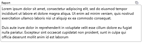
You can add calculated values to a text field by using the keyword tool in edit mode. These keys will be replaced by a value in view mode.
Milestones
The milestones element lists all milestones of all types in the project, together with status information.

Statistics of when it is projected to be reached is shown for all milestones, or when is was reached if it has been. For deadlines the deadline date and probability is shown. For prio points the priority value is listed.
Progress
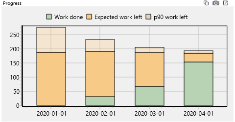
The progress element is a bar graph with one bar for this and each previous report. It shows work done in green, expected work left in orange, and a p90 value for work left in transparent orange. P90 meaning that it is, according to the current estimates, 90 % sure that less work than this is required.
Notes

Notes is a special text field that is only visible to the manager of the project. It is a place for the manager to add notes that are valuable only for the project management, but may be unnecessary and confusing to any one else.
Headline

A single text line, in a bold font. May be useful if you want a super short summary of the project status. Maybe even a single emoji (win + . to open the windows emoji keyboard).
Scheduled developers

This element type displays a pie chart showing how much remaining work is scheduled on different persons.
Edit and delete
 To edit a report, click on the edit symbol on the report headline. The report will be opened in the edit area. You can edit it the same way as when you create a new report.
The update report data button will update calculated values, if new information is available for the report period. It will not use data regarding dates after the report date. Some information, such as milestone status, can not be updated as its historical values can not be recreated.
You can never change the creation date for a report.
You can delete a project report, but be careful. You can not undo or recreate the deleted information. If you delete a report between two existing reports, you may want to update data in the following report so that it represents the new period, as it now has another previous report.
Tips and tricks
It is a good idea to agree on a standard format for reports, so that the overview tools can be used to full potential, and so that the intended readers gets the information they are interested in. You can then add extra elements to the report for special project needs.
Regularly writing project reports is valuable even if no one reads them. This enables a habit of reviewing, updating and reflecting on the project as a project manager. The generated reports are also valuable when learning from past projects, when you easily can follow what has happened, and with good reports, why.
It is also a good idea to make sure activity statuses and estimates are up to date before creating the report. You can check in the reported time overview on the home page that all team members have committed their time reports.
The “Follow up” tab, described in the next chapter, is a good tool to use to check what has happened in the project when writing a report.
Follow Up
▶ Video reference Manager @ 8:27The follow up tab contains tools to investigate what has happened in projects. On the left side is a project tree view to select what you want to get information on. On the right is an information display area. The three tabs are used to display information in three different ways.
 The Reports and Updates tab lets you see time reports and activity update reports.
 The Timeline lets you see the work done on a timeline. Its like a Gantt chart, but for what actually has happened.
 The Diagrams tabs lets you create diagrams for your selected data.
Data selection
The left side of the Follow up tab is used to select what data you want to see. The most important setting is the “Show work from” date setting in the upper left corner. Data will be shown from that date and up to today.
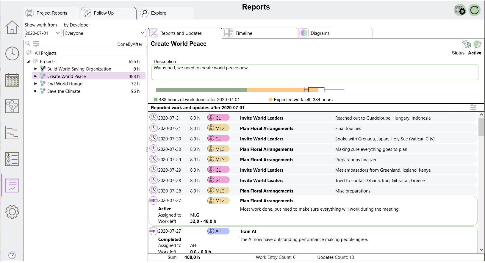
The by Developer drop down lets you filter so that you only see (or highlight) work done by one person. Default is Everyone, which includes all reported work.
Below is a project tree view, where you can select a category, project, group or activity to show work for. There is also an “All Projects” option to include all reported work in the selected time period.
The tree view has the search and filter functions common to most tree views in the program.
Reports and updates
Reports and updates lists time report entries and activity updates in a list. This works the same way as the list in the “Update Activity Status” tab on the Report Time page.
Above the list information about the selected item is displayed.
If you select “All Projects” or a category, only activity update reports are listed. Time reports are filtered by the “by Developer” setting, activity update reports are not.
You can change how the list is displayed by clicking on the filter button, giving you the following alternatives.
- Work and Updates
- Work by date
- Work by person
- Work by comment
- Updates only
At the bottom there is a row showing statistics for the activity. You can select multiple time report rows by shift and ctrl clicking on them, and see the sum of the work they represent.
Timeline
The timeline view displays the reported work on a timeline. The current date and the selected data are marked with purple.
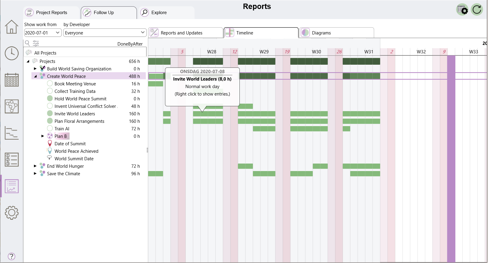
You can navigate the timeline as other timelines. Use the scroll wheel to zoom and hold left mouse button to pan. You can also use the w, a, s, d keys, + and - to zoom, and press h to reset the pan.
For each day a green bar indicates how much work has been reported. The bar gets higher and darker the more work it represents. Hold the mouse cursor over a bar to see how much work it represents. Right click to see up to five time report entries. Right and left keys moves the information bubble one day at a time.
If you have the “by Developer” filter active, work reported by the selected person will be displayed with orange bars on top of the green bars.
Diagrams
The diagram tab lets you create different types of diagrams for your selected data. The options toolbar above the plot area lets you choose what information and how to display it.

Choose to display
- Work: reported work by activity
- Who: reported work by person
- Work Type: reported work by work type
as Time or Cost
- Time: show reported work as hours
- Cost: show reported work as cost. The time in each time report is multiplied with the hour cost of the person at the time the report was entered.
Chart type
- Pie: a pie chart where each category is a pie slice.
- Bar: Bar chart with one bar for each category.
- by Week: one bar for each week in the time period, with categories in different colors.
- By Month: same as above, but for months
And finally you can select to show up to three charts.
- Reported History: includes reported work from the set start date under “Show work from”
- Planned future: includes the scheduled work planned for the future
- Total: Includes both history and future
Diagram tools
In the top right corner of the diagram area you will find a few tool icons.
Open in new window: Opens the diagram in a new window.
Copy image to clipboard. Puts a bitmap copy of the image in the clipboard
Copy data to clipboard as text. Puts the data used by the chart as text in the clipboard. It can for example be pasted into a spreadsheet.
 Toggle 3D. Toggles a 3D effect on the diagram.
 Toggle legend: Toggles showing a plot legend on the right, above or not at all.
 Rotate bottom axis labels. Rotating the labels can be useful if they are to long and overlapping.
 Change bar stacking: Switches between different ways to stack bars.
 Change mark information: Switches between different information to put in pie chart marks.
 Toggle marks: Turns pie charts marks on and off.
 Change color palette: Switches between 16 preset color palettes.
Explore
The explore tab gives you tools to explore information from all your projects, past, present and future. You select conditions for data to be entered into a matrix. This data can then be plotted in various diagrams. You can double click on a matrix cell to see and further investigate the data that makes up this cell.
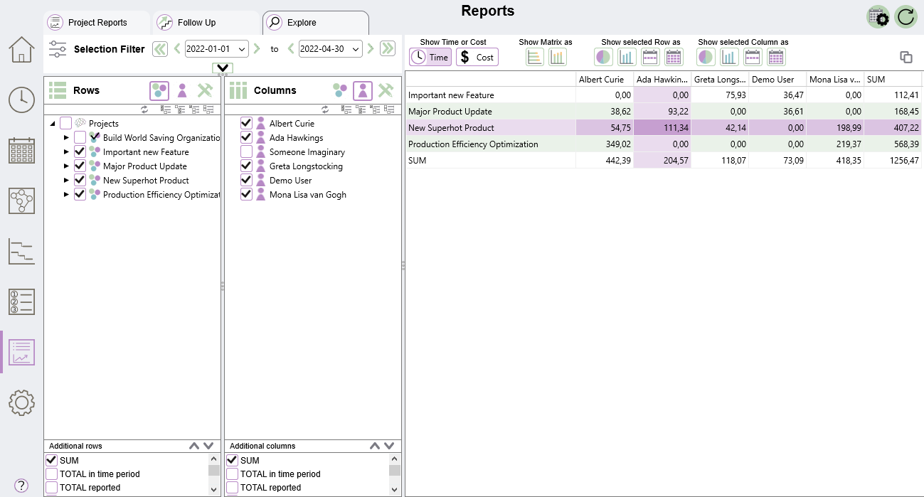
Data selection
Selection Filter
The selection filter creates conditions that all data in the matrix must meet. By data we mean time reports entries or future scheduled work entries.
The most important one is the date condition. Entries before the start date or after the end date are not included. The single arrows on the right and left side of each date steps the date one week. The double left arrows moves the date to the very first entry date, so that all time reports will be included. The double right arrows moves the date to the last scheduled entry, so that all planned work is included.
You can expand the selection filter area by dragging the divider, or by clicking on the down arrow. This reveals more filter options.
On the right side you can select specific projects, activity groups or activities, specific people or specific work types. Only entries that match your selection will be included. On the right side you can create conditions for specific states.
Data condition types
There are three symbols reoccurring on the left side, to select a data condition type.
 The project symbol lets you select projects, activity groups or activities.
 The developer symbol lets you select specific people.
 The work type symbol lets you select work types.
Rows and columns
The row and column areas lets you define what rows and columns you want in your matrix. Select the condition type and click the check boxes for the things you want. Each cell in the matrix will include data that meets the selection filter conditions and the corresponding row and column conditions.
Above the selection there is a small tool set:
 Switch row and column
 Select / Unselect all siblings to the marked item
 Select all children to the marked item
 Unselect all children to the marked item
 Unselect all items
Additional rows and columns
Below the main selection area are check boxes for special additional columns. You can expand them by clicking on the up arrow to see all options.
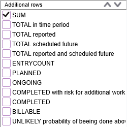
These additional rows / columns do not add conditions, but rather calculations on the data selected by the row or column.
The data matrix
On the right side the resulting data matrix is shown. Above the matrix is a tool set.
You can choose between showing hours of work in the matrix, or have it converted to cost according to the hour cost setting for each developer.
The Show Matrix as buttons will open a new window with the matrix shown as a stacked bar graph. The graph window tool bar is explained here.
You can click in the matrix to select a row and a column. The Show selected row / column buttons will display this data as a graph in a new window.
 Shows a pie chart where each row / column is a pie slice.
 Shows a bar chart with one bar for each row / column.
 Shows one bar for each week in the time period, with rows / columns in different colors.
 Shows one bar for each month in the time period, with rows / columns in different colors.
The rightmost button in the toolbar copies the matrix as text to the clipboard. You can for example paste it in a spread sheet.
Entries exploration window
If you double click on a cell in the matrix an entries exploration window will open. This will not work for cells belonging to any of the additional rows or columns, such as the sum row.
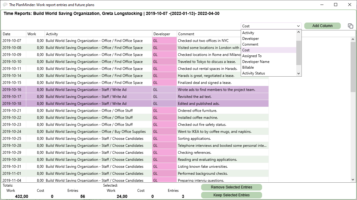
In this window all the entries that meet the conditions of the cell are listed. This table can be copied as text with the “Copy data to clipboard as text” button.
The drop down menu shows available columns. You can select one and use the button to add or remove a column from the table.
Click on a column header to sort the list by the data in that column.
You can select rows by clicking on them. Hold shift or ctrl to select multiple rows. Below the list you can see statistics about the list as a total, and about the selected entries. You can remove entries from the list with the “Remove selected entries” button. The “Keep selected entries” button removes all entries that are not selected.


