The PlanMinder Manual - 12 Progress Overview
This is one chapter from the manual. Access the full manual here.
Progress Overview
When you have the description overlay open for an Activity, Activity Group, or Project, you will see this symbol on the right side:

Click on it to show the progress overview. The purpose of this overlay is to show what has happened so far, and what is expected to happen in the future.
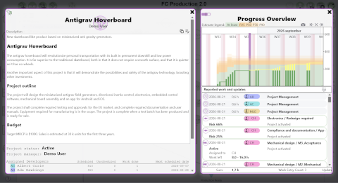
The progress timeline plot
The top part of the overlay shows a timeline plot covering both the history and the planned future. The y-axis represents amount of work in hours, and the x-axis calendar time. You can click and drag to pan the timeline, and use the scroll wheel to zoom. The grey tool symbols above let you pan to get the first or last event in view, and to reset the zoom to auto.
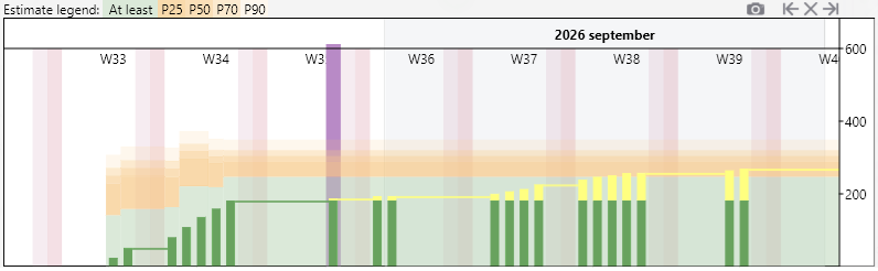
The current date is marked with purple, differentiating between history and planned future. The green and orange semi-transparent background bar graph shows what the estimates and probabilities were at different times, and what they are now. Green shows the best case scenario, including reported work and estimates. The different shades of yellow indicate different probabilities, as the legend above shows, ranging from the 25% probability labeled P25 up to P90 for 90% probability of completing in less time. The history part of this plot can show you if there has been discoveries or changes that have altered the prediction of how much work is required, or how much risk is involved.
The darker, narrow opaque green lines on each date shows the accumulated reported work. When passing into the future, yellow is added on top representing planned work.
Note: Deleting an element from a plan will delete its history too, and it will not be represented in this plot. Moving elements between activity groups is not tracked. Element history will be plotted according to their current activity group only.
Reports and Updates
Below the plot, all time reports and updates are listed. Updates include changes to activity status or estimate, and to discrete risks. It is the same list as in Reports / Follow Up with the latest event first, unless you choose to filter and list them in a different order.
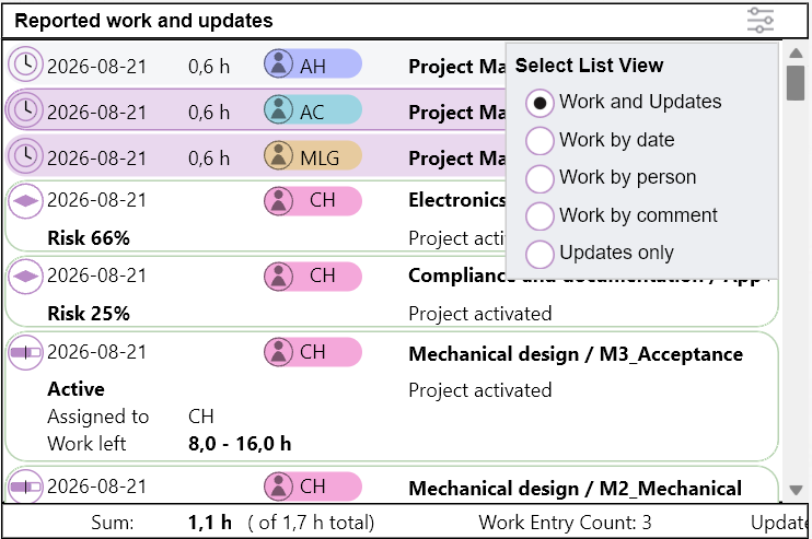
When hovering the mouse pointer over an event, a small green arrow in the plot will indicate when this happened. This may help you track why the projected amount of work or risk has changed.
You can select multiple time reports in the list using Shift-click or Ctrl-click to calculate the sum of the selected work.


